App identity and social media
PinPoint
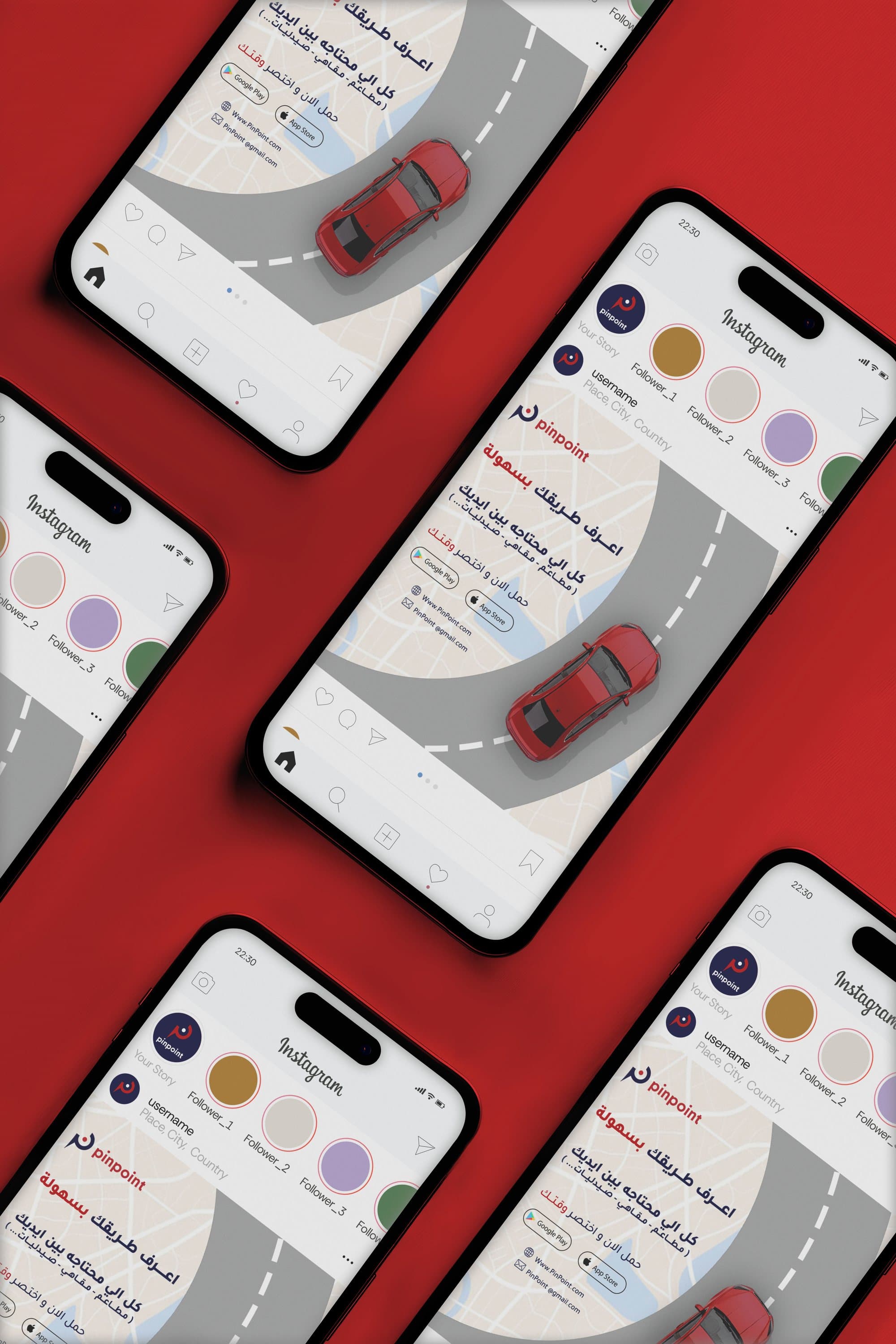
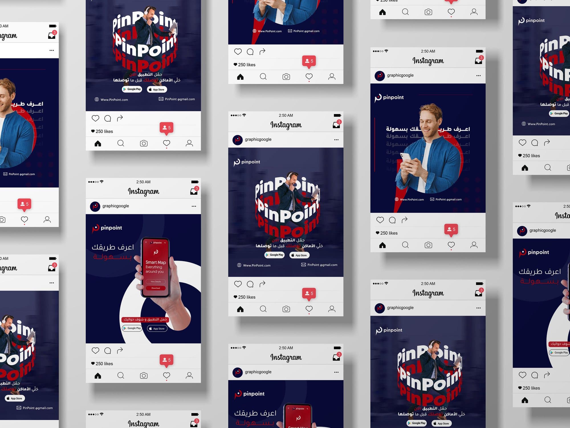
Social media for a map app, with one post that borrows from a 1923 Bauhaus poster.
- Year
- 2025
- Product
- Location-based app
- Work
- Campaign posts, app visuals
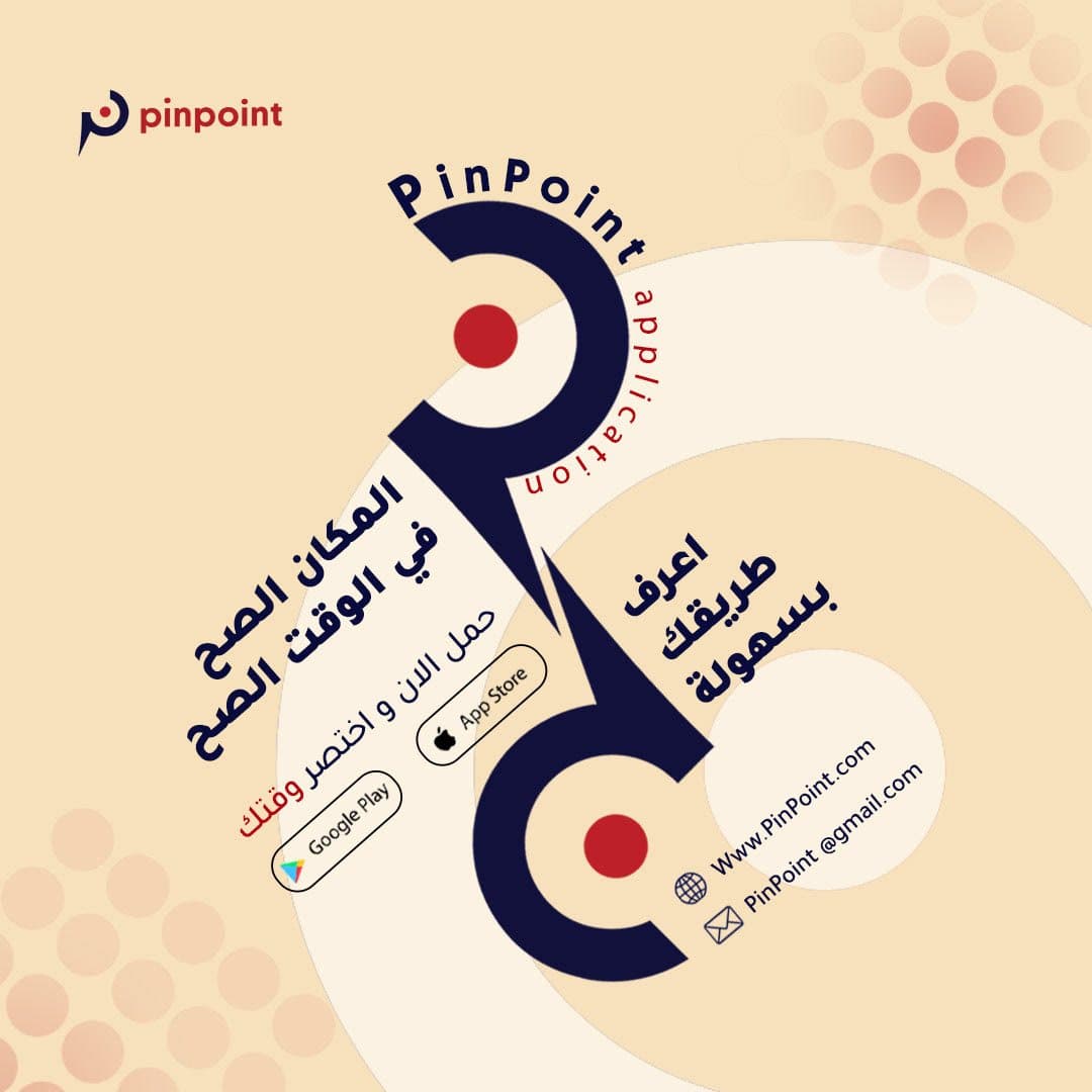
The app
PinPoint is a location-based app that helps people quickly find nearby pharmacies, shops, hospitals, restaurants, cafés and other essential services.
The direction
Clarity, speed and trust, because the app’s whole job is to guide people accurately to what they need. Bold composition, type that seems to move, and a clear hierarchy.
The colours
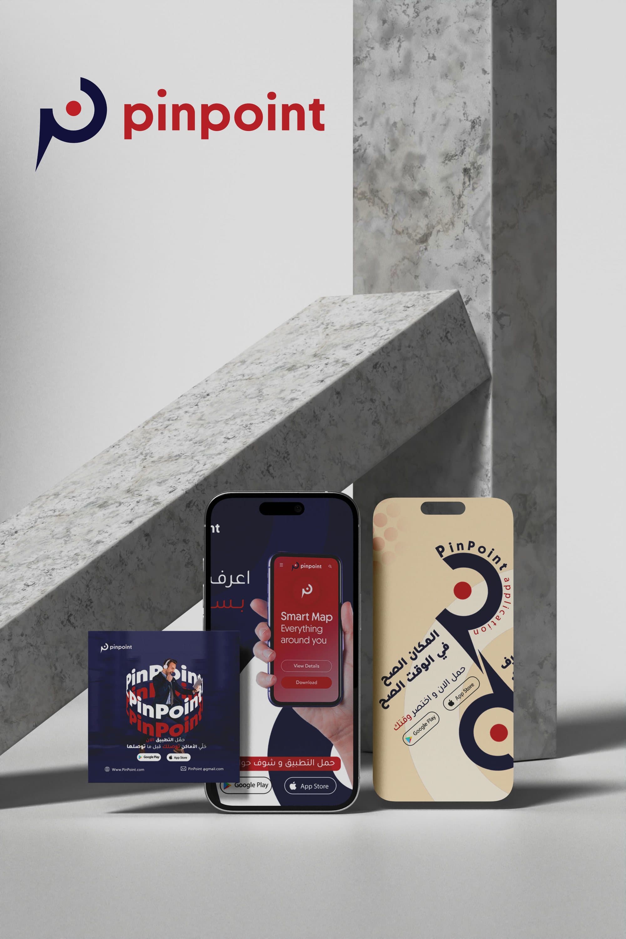
Blue for trust and navigation, red for key points and calls to action, grey for clarity and balance, and salmon for warmth and a human touch.
The Bauhaus post
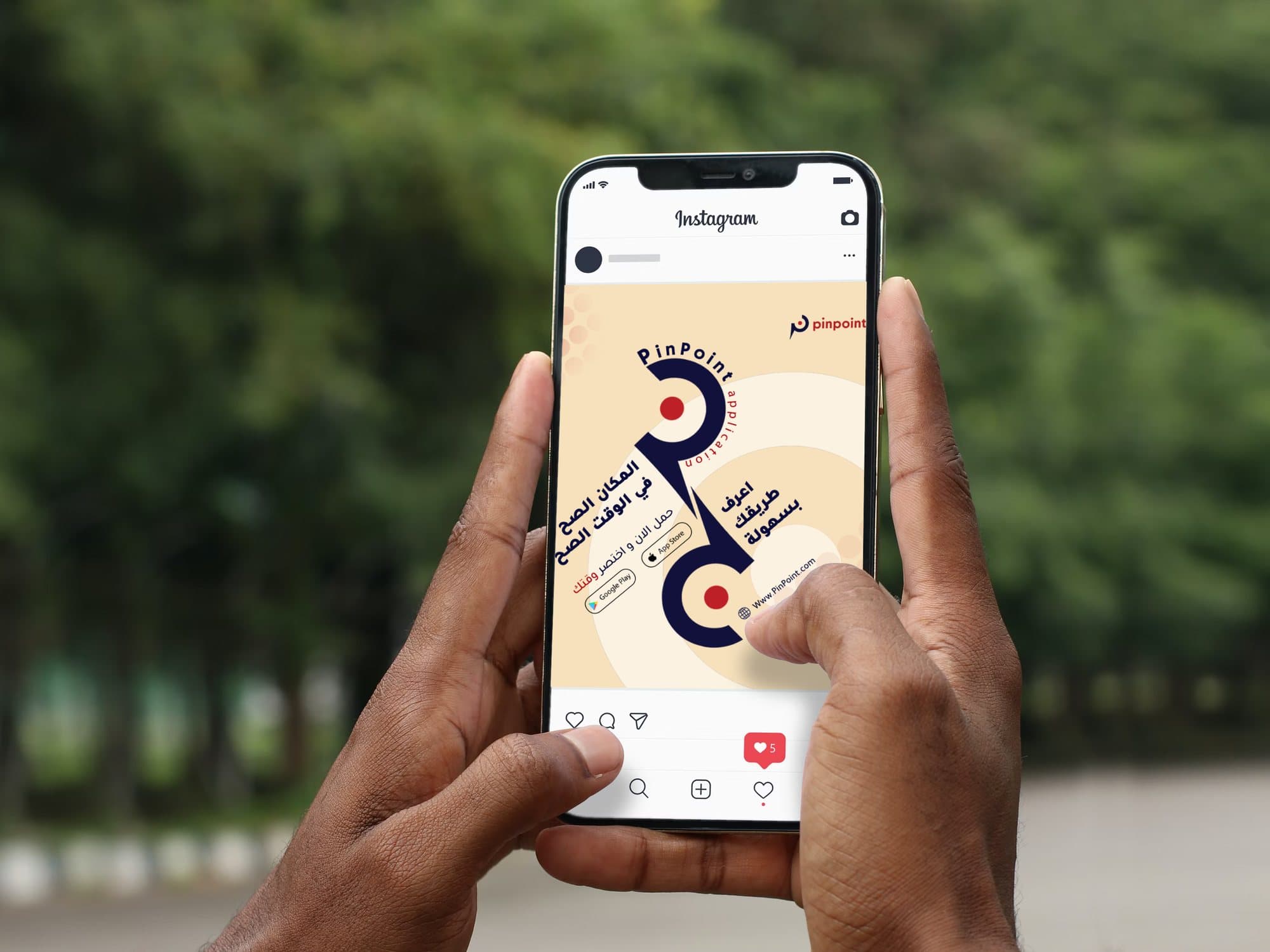
One post reworks Joost Schmidt’s poster for the 1923 Bauhaus exhibition in Weimar: geometric abstraction, bold type and balance, carried into a modern app campaign. Inspired by Bauhaus, reimagined for today.
Colours
- #202447
- #E0242F
- #A9AAAA
- #F8E2BD